Sell online
Neto (now Maropost) offers a SaaS platform for businesses to run their ecommerce store and point-of-sale on, as well as tools to manage their inventory. Neto also do in-house website development for clients who use the ecommerce platform.
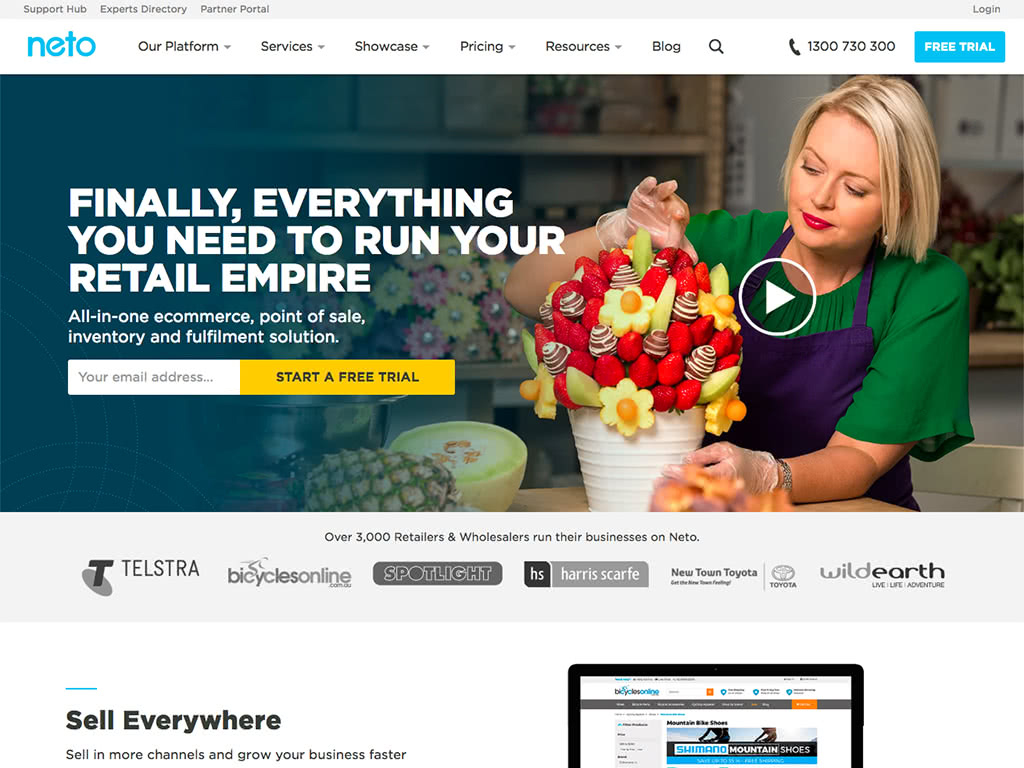
I joined Neto in 2017 to take ownership of the Neto public website.
Along with building out our web capabilities, I also worked on:
- user acquisition
- marketing campaigns
- print asset design
- analytics
- copywriting
- user testing
- user interface design
- product development
What? We have no landing pages?
Before I joined Neto, the marketing team had no way to create dedicated landing pages for campaigns. Paid acquisition were directed to the homepage or the free trial page, which were of low relevance and thus gave us junk quality scores.
The first win for moving to CraftCMS was to give marketing staff the ability to build landing pages from a set of pre-defined components.
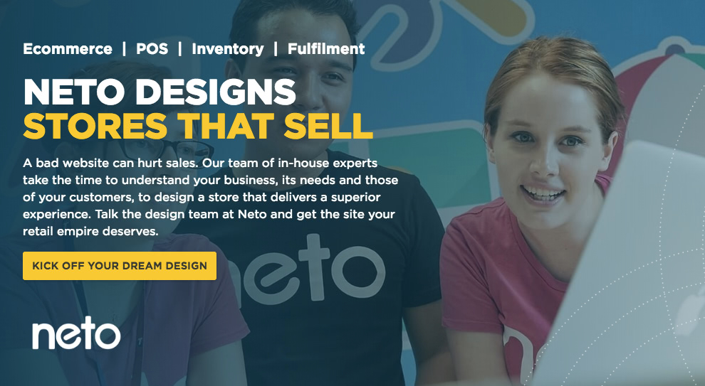
We established a list of components (eg. hero banner, feature list, call-to-action, etc.) and all possible permutations. From this, I built flexible templates and data structures using CraftCMS’s powerful matrix to accommodate different layouts and copy.
I engaged everyone who needed to create a landing page, including sales, marketing, and the partners team. We went through a few iterations, testing visual layouts for best click-through rate, and tweaking the content editor to make it as intuitive as possible. I then documented the process, results, and best practices.
Wins
Using targeted landing pages, we were able to:
- Reduce our ad spending
- Match the ad messaging to the page content
- Better attribute conversions to their campaign
Pain points
Issues encountered were mainly on the content creation end:
- Achieving a balance between too much editing freedom, and not enough. Eg. allowing authors to add their own HTML proved a nightmare to maintain and unclosed tags could break the page.
- Authors don't understand responsive design; and don't ever test on mobile. Eg. insistence on “above the fold” content, and using images that were too large.
Migrating the Neto website
The website is key for acquiring new customers. Neto’s acquisition (and our target metrics) relied on converting prospects to a free trial of the ecommerce product; followed by a sales call.
Neto had built its customer-base from Australian retailers, but was looking to expand to an international market. This involved not only updates to the product, but migrating an established, public website from an Australian domain: neto.com.au, to a global domain: netohq.com.
With multiple stakeholders, stale content, and poor accessibility, migrating the website presented some technical and logistical challenges.
Setting up a new shop
The website on the neto.com.au domain was built using Neto’s own SaaS platform, which—although decent for ecommerce—lacked the capability required to be the content management system that we needed. I took this opportunity to completely rebuild the site with a dedicated CMS and modern web standards. This would help achieve our migration goals, which were:
- Market to customers outside of Australia
- Allow anyone to create campaign landing pages
- Easy-to-use CMS for non-technical staff
- Faster blog publishing
- Assets managed from one place
- Document history for legal pages
- Faster development and iteration of the website
- Improved on-site SEO
- Improved all-round visitor experience
I evaluated several content management systems and settled on CraftCMS for its ease of development, flexible template model and community support.
A dozen non-technical people in the company have since used the new CMS to publish content and all have found it much more intuitive and easy to use than the previous system.
As the sole developer, building on CraftCMS has been a great experience, and allowed me to address feature requests and implement changes rapidly.
Migration pain points
There are delicate SEO issues in migrating existing content to a new domain. It’s a chicken and egg problem of attempting to build up domain authority on the new netohq.com domain without negatively impacting organic traffic on the existing domain.
We settled on a hybrid approach of migrating one section of the website at a time (eg. blog posts), implementing the appropriate hreflang tags and measuring the impact. After a few weeks, we would then 301 redirect that section.
For some sections, especially documentation, we saw an initial drop-off in traffic, which slowly started to recover after the new pages were indexed by Google and netohq.com domain authority improved.
Neto had invested a lot in SEO for neto.com.au, especially link building. So our CEO was very adamant that we not impact any progress made. Thankfully, most of our acquisition was through paid channels, so the initial reduction in organic traffic was mitigated. The move was necessary for our business roadmap. Sometimes you have to ignore sunk costs to move forwards.
Finding experts and add-ons for your store
As well as earning revenue through recurring monthly plans, Neto derives some of its revenue from:
- Design and setup services
- Integrations with third-party software (eg. customers using a particular shipping or payment service).
Neto has relationships with design studios around Australia who build ecommerce websites for clients and we advertise their services on the website as Neto Experts.
Likewise, Neto partners with companies who offer integrations with the Neto platform. These are advertised through the public Add-ons directory.
Our Experts directory and Add-ons directory:
- Contained out-of-date content which was hard to update
- Were difficult to navigate and to find relevant information
- Did not meet accessibility and coding standards
Though similar in some respects, the user intent differed between the directories.
Third-party integrations with Neto
For add-ons, we want to answer:
- For a new user: “does Neto integrate with the software I already use?” (looking for something specific)
- For an existing user: “how can I improve my store?” (looking for inspiration and future capabilities; general browsing)

Showcasing our third-party integrations is most important for customers switching from another platform (eg. Shopify). It’s often a deal breaker if Neto cannot integrate with all the software that their previous platform integrated with.
I audited the add-on content and rewrote most of the descriptions to focus more on each one’s benefits to a Neto user, rather than features and marketing spiel.
To allow users to browse faster, I added:
- A quick-search to filter the listing page by keyword as you type
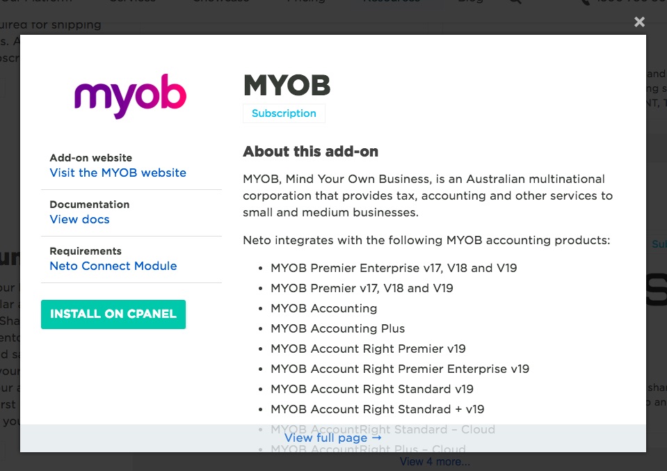
- A quick-view to show add-on in a popup instead of loading a new page
Need a Neto expert?
The Experts directory was more involved, as users needed to be able to refine the list of experts by the type of services they offered, location and budget.
I experimented with a few designs and settled on putting the filters directly in a sentence:
“I'm looking for help with X services in Y location for Z budget”
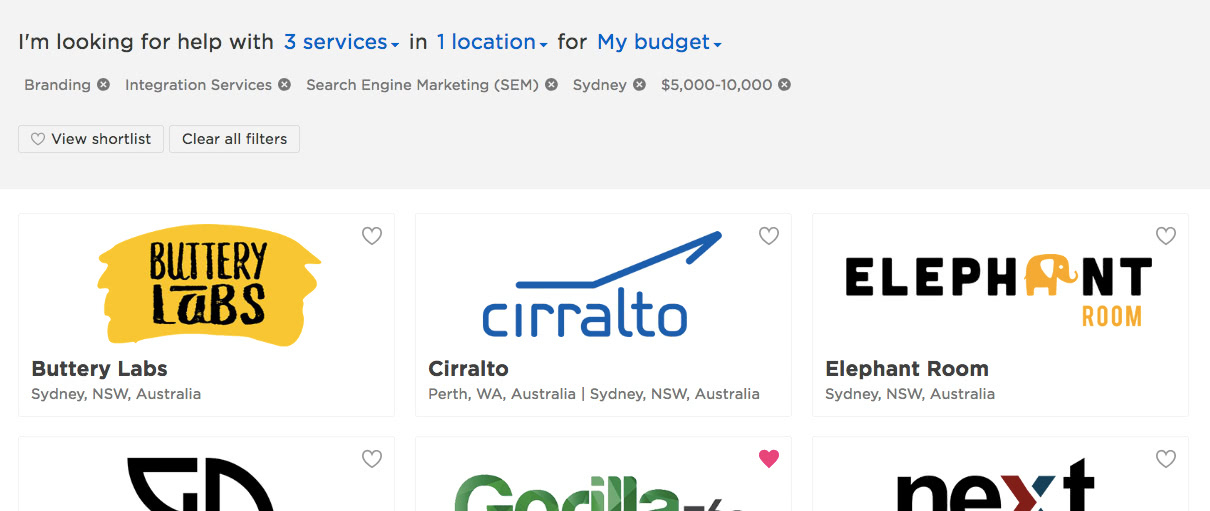
This allows users to compose their query more naturally than with separated dropdown fields.
We added event tracking to these directories to monitor and measure click-throughs, engagement, if experts were contact, and if add-ons were installed. We have seen an increase in visits but did not have historical data to compare events from the previous version.
Improving our pricing
The pricing page is a vital conversion point that simply wasn’t pulling its weight on neto.com.au. Neto pricing is a bit more complicated than its competitors, as there’s a fair amount of room to customise your subscription plan. Our goals were:
- Improve conversion rate
- Clearer value proposition
- Better explain terminology, and plan differentiation
- Add new plans and sales channels
- Allow authors to manage the page through the CMS (and rollback changes)
- Allow user to calculate total plan cost
- Sell more large plans
- Improve metrics on visitor behavior
I worked closely with the sales team and used their feedback and knowledge of our customer needs to build a new pricing page.
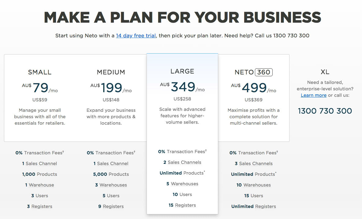
Some improvements made to the new version were:
- Split out the complete feature list to give the key comparison points more focus
- Clearer call-to-actions and next steps
- Improved explanation of Sales Channels
- More than halved the page load time
- Made the page easier to use on mobile
When the new pricing page went live, we saw:
- An immediate increase in the clickthoughs from this page to start a free trial
- Lower bounce-rate
- Prospects using the pricing calculator to generate quotes
The sales team were also happier as they rely on this page often when talking to prospects.
Calculate plan pricing
One recurring complaint we had from prospects was they had difficulty calculating the true cost of using Neto. To address this, I built a pricing calculator which allowed prospects to:
- Select requirements for their business
- Give them a price estimate
- Recommend the best plan
- Email them a quote
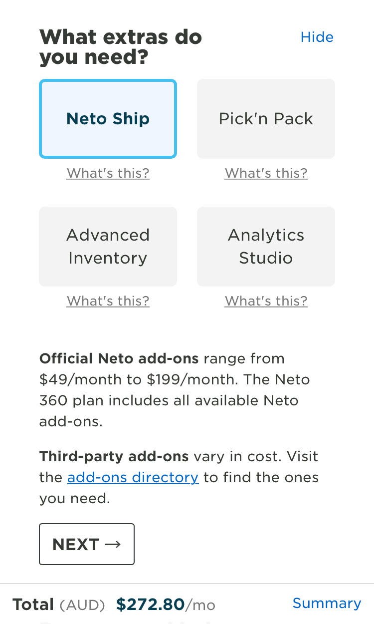
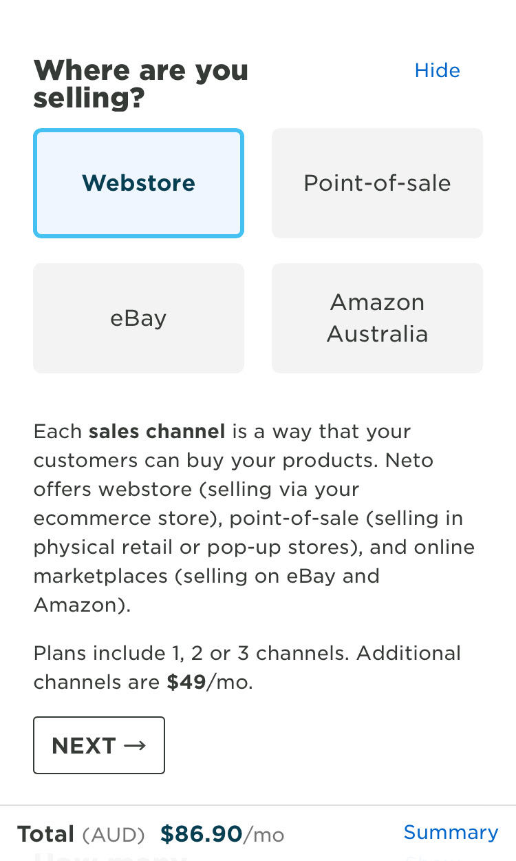
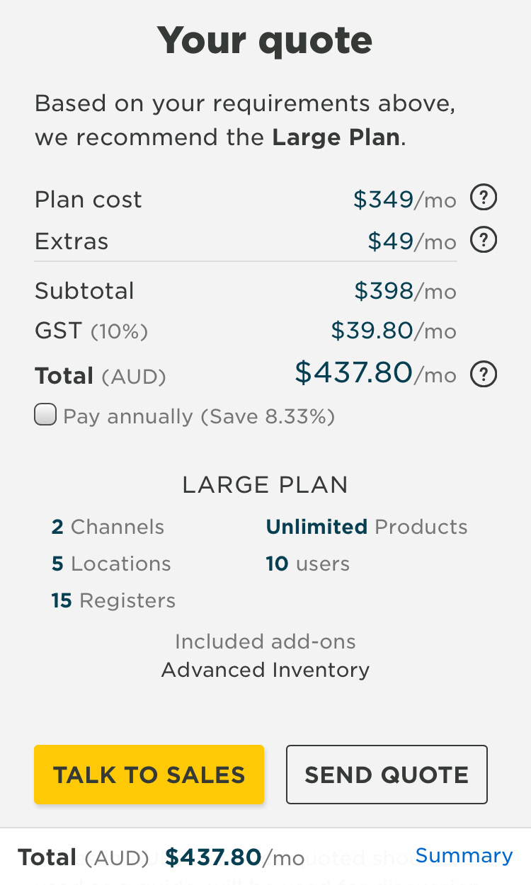
The calculator was built quickly using VueJS. The reactive data-binding allowed the price estimate to change immediately based on their selection.
I planned to take this further so users could estimate their setup and store design costs, but we can’t accurately quantify these prices yet. However, the calculator is flexible to allow this in future. It also supports multiple currencies and tax rates, for New Zealand users.
This was also useful for Neto’s design partners, enabling them to more accurately quote their clients.
